Worksheet Crafter User Manual
|
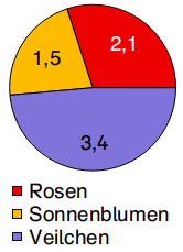
Create bar, column or pie charts.
|
|
The Diagram Item is available in Premium Edition and Unlimited Edition 2025.2 or newer. Learn more. |

Creating a New Diagram
|
Use the toolbar icon pictured on the left to place a new diagram on the worksheet. For more information see the chapter "Creating Items". |

Diagram Toolbar
Select the diagram item. The toolbar will now be shown in place on the worksheet. You may move the toolbar by dragging it while holding down the left mouse button.
All settings for the diagram are available in the toolbar:
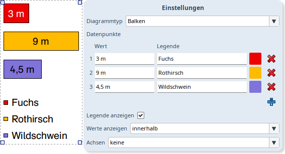
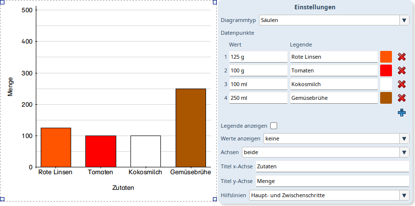
Diagram Type |
Choose whether your datapoints should be displayed as bar, column or pie chart. |
Datapoints |
Enter your diagram data. Learn more in the section datapoints below. |
Show legend |
Add a legend to your diagram. |
Show Values |
Choose if and how the values in your diagram graph are displayed. Available are none, inside and outside. |
Axes |
Not visible for pie chart. Show coordinate axes for the diagram: none, only x axis, only y axis, both. |
x axis label |
Edit the label text for the x axis. Removing the text removes the label. |
y axis label |
Edit the label text for the y axis. Removing the text removes the label. |
Grid lines |
Only visible if the value axis (bar chart x axis, column chart y axis) is shown. Draw grid lines for the values on the coordinate axis in the. Choose between none, without intermediate step and with intermediate step. |
Datapoints
Add more datapoints by clicking the blue '+' in the diagram toolbar.
The red 'x' at the end of each datapoint allows you to remove it.
For each datapoint you may edit the following:
•Value: Sets the size for this datapoint in the graph in relation to the others. The toolbar allows you to choose if and how the value itself is displayed in the graph. For this it comes in handy that you may enter text after the value. E.g. when you enter. "3.5 kg" this will be part of the label in the graph.
•Legend: Enter the description for this datapoint that will be shown in the legend.
•Color: Click the colored square to choose a different color for this datapoint.
Coordinate Axes
For bar and column chart you can enable coordinate axes. The values on the axes will be programatically determined based on your datapoints. This changes the size of the bars or columns.
For the value axis additional grid lines can be drawn. For details view the description of the diagram toolbar settings above.
Positioning Graph and Legend
Select the graph or legend with a double click.
Move it to the desired position by dragging it while holding down the left mouse button.
Change the size via the drag handles. When you change the legend's size the entries will be automatically distributed over the available space.
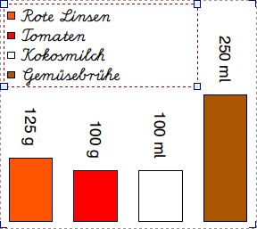
Changing the Font
The font can be changed with the text formatting toolbar. Select graph or legend with a double click to edit the font only for this part of the diagram.
When the text does not fit the item it will be cut off. Change the font size or increase the item size until the text fits again.